@JS
That is very helpful. Thank you. Your reply obviously crossed with my additional thoughts. I am very grateful to you. Ian
 JS
JSParticipant
Veteran
Hi
@iac381
The code runs at the end of each bar.
Suppose your time frame is 5 minutes and in these 5 minutes the momentum goes from negative to positive then it meets the conditions that the momentum crosses the zero line (from bottom to top) and this whole 5 minute line will turn green.
The smaller your time frame, the more accurately the (color) line will be drawn.
You can have as many lines drawn as you want and at what level you want.
Suppose you calculate the momentum over a longer period of time and for example 100 comes out and your central zone is 25, for example, then you can have a horizontal line drawn on: DrawHLine(100/25) Coloured (0,0,255)
@JS
“The term “Coloured” behind DrawHLine ensures that the horizontal line gets a certain color. Coloured(R,G,B) means R = Red, G = Green, B = Blue and you can set these colors with a certain value (0 to 255). (0 is no color)”
One thing that intrigues me is that you make no mention of B (blue) in your code, and yet the HLine is blue? How does that work?
And can one use e.g. W -white, Y – yellow, P – pink/purple? etc
 JS
JSParticipant
Veteran
Hi
@iac381
DrawHLine(HLine)
Coloured(
0,
0,
200)
The term “Coloured” after “DrawHLine” provides the color of the horizontal line, here (0.0.200) Red=0 Green=0 and Blue=200
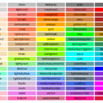
These are the defined color names (screenshot 1)
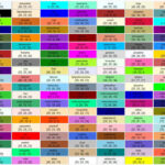
This allows you to compose your own colours so, by combining the values of R, G and B (screenshot 2)
I know it is a rough way to do it, i’m using segment, but we should calculate the line slope coefficient in order to get the same visual as the original indicator, but question of topic is just about colors, so here it is:
Once n = 20
Once Hline = 0

xMom = Momentum[n]

DrawHLine(HLine) Coloured(0,0,200)

cross=0
if xMom crosses over 0 then
cross=1
r = 0
g = 255
elsif xMom crosses under 0 then
cross=-1
r = 255
g = 0
endif

if cross=1 then
drawsegment(barindex[1],0,barindex,xmom)coloured(0,255,0)
drawsegment(barindex[1],0,barindex[1],xmom[1])coloured(255,0,0)
elsif cross=-1 then
drawsegment(barindex[1],xmom[1],barindex,0)coloured(0,255,0)
drawsegment(barindex[0],0,barindex[0],xmom[0])coloured(255,0,0)
else
drawsegment(barindex[1],xmom[1],barindex,xmom)coloured(r,g,0)
endif

Return xMom coloured(r,g,0,0)
@ Nicholas
@JS,
Thank you very much. That is very helpful. I take the point about the coding request coming under the topic heading I gave it, limiting scope at this stage. It is relevant, even if the final solution will be revealed under a modified heading which you may like to suggest?
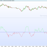
I am attaching three screen captures all of the same time period today, 1 x Dax 5m IG Platform DFB and 2 x PRT through IG. The chart with golden circles is highlighting the result of implementing your adjustments. The chart with white circles implements
@JS’s briefer code, but with my introduction of a separate horizontal line in white, that seems to be necessary in order to create a Colour Zone that
DOES change colour exactly at the line (like the Histogram version of Momentum!). The differences are only minor but they raise the question of how to get it as precise as the ‘original’ IG version.
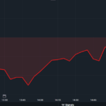
Finally, in your version I was unable to make the Momentum line bolder so it is more difficult to see. There is still some peculiarity to the line as you can see in close up.
Yes, like I said, i’m using SEGMENT (graphical line plotted), not real value. So in order to draw a segment from point A to point B, we need to calculate an affine function with the correct slope. It is tricky, but doable of course, but time consuming I guess for just a color change purely esthetic? BTW it could be an interesting example. I do not have time now until next Tuesday.
@Nicholas,
The finer points of coding segment and real value are well above my pay grade (as you may have gathered from my ‘conversation’ with
@JS!).
Tuesday is fine with me. It is aesthetics, but it is also about ease of reference when you look up at the screen without having to be distracted by details that need elimination. Thank you once more.


