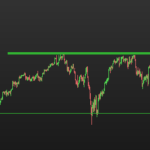
Generally, data points are plotted on a chart, as in this case using x and y coordinates.
The right hand side shows the y-axis scale, usually the price in a price panel.
The chart scale can be set to different types, Linear, logarithm, percentage and Base100.
It appears that, from image, yours is set to Base100.
Due to the font size of your chart, the label is bigger than the space available, so the end is cut off.
To change type, right click on the scale, then choose ‘Scale Type’, select option.
For myself, I only have used linear and have no further comments on the different types.
However, in coding I think that all direct references to price are linear for the open, high, low close etc. If outputting values to the chart, the linear values from code are converted and drawn to the chosen scale.
If inputting values from a non-linear type scale , then I think that’s a different story. If you wanted to use other scales, you would have to convert the non-linear value to the linear value.
Easy solution, stay on linear or flick to linear to get the linear value.
Regarding the conversions, since not used, I don’t have the formula’s maybe other’s can elaborate further if needed.
3 users thanked author for this post.